
This is the final two color logo, the feeling of progress to the north star and movement all worked well together to create a solid logo and readable from a distance
The client wanted to try different ways of breaking up the text below the logo before we moved to the final logo selection
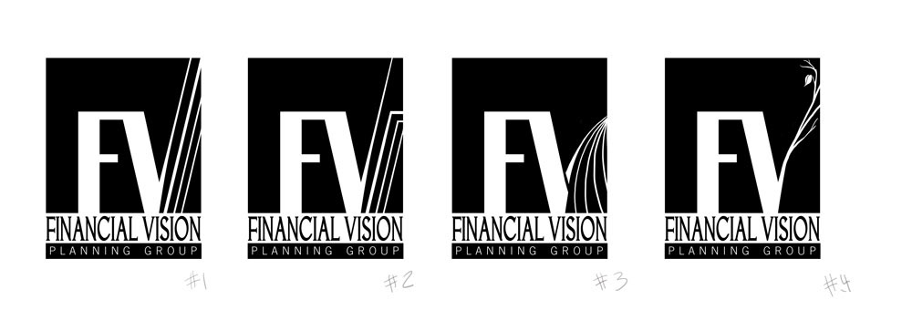
Here is where I take what the client liked and begin to tweak it for more appeal. The client ended up liking #3 the most and I began to flesh out more details
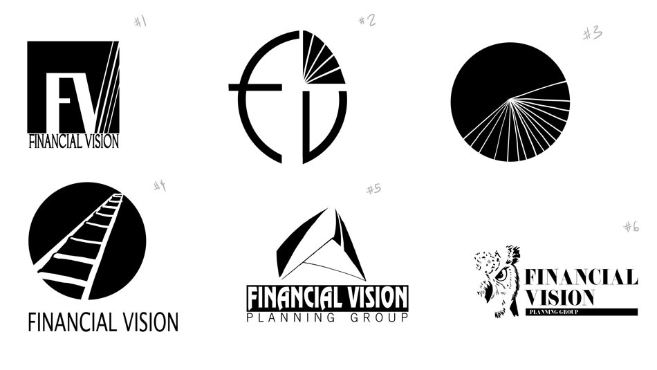
Concepts for potential logo, the challenge was to not be too cliche (the ladder) but not too far out there #5. Eventually the client chose #1 to flesh out more